
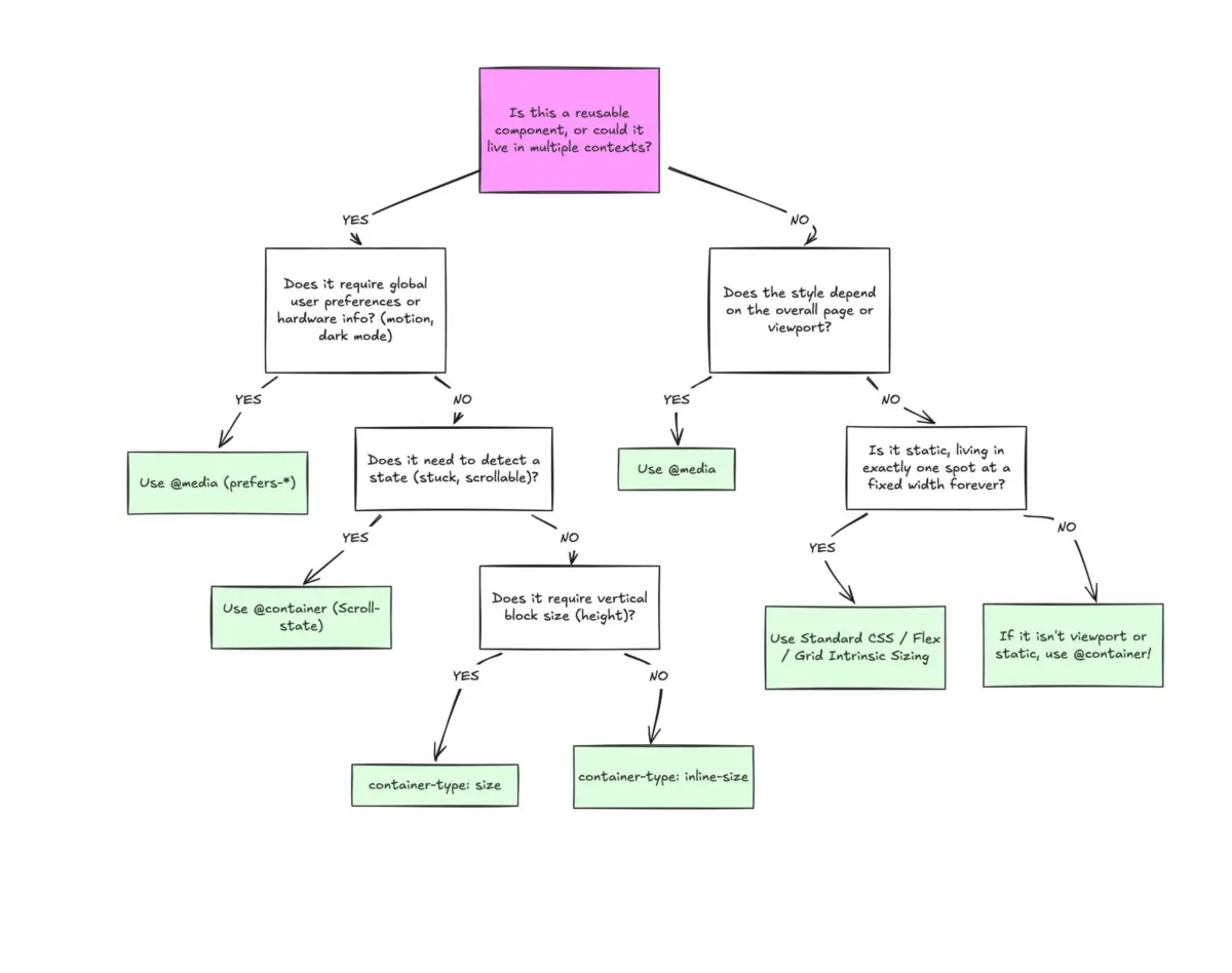
Despite broad browser support and years of anticipation from frontend developers worldwide, container queries remain surprisingly underused and frequently misunderstood across the web development community. Industry experts note that many developers continue to approach container queries with the exact same mindset they apply to traditional media queries, missing the fundamental shift in how modern, reusable components are designed to respond naturally to their immediate environments.
When CSS Container Queries first rolled out across major web browsers, many developers greeted the news with a familiar sense of hesitation. For years, media queries had served as the undisputed standard for responsive design, creating the universal impression that screen width alone was responsible for how applications adapt to their surrounding environments. When asking the browser a question via @media, developers were simply inquiring about the current width of the screen.
While media queries answered that question reliably for macro-level page layouts, they created persistent challenges at the component level. Industry figures like Kevin Powell, speaking at recent web development conferences, have pointed out that container query adoption rates remain surprisingly low given how long flexible component design sat at the top of developer wishlists. According to recent industry surveys, the vast majority of developers are well aware that container queries exist, yet a significantly smaller percentage actively utilize them in production environments.

The underlying issue stems from visual familiarity. At first glance, container queries look almost identical to traditional media queries. Because the syntax shares a striking resemblance, it is easy to assume that both features serve the same fundamental purpose and operate under the same architectural rules. However, web standards experts emphasize that they do not work the same way at all. While the core focus centers primarily on container size queries—a responsive design technique reacting to the physical dimensions of a designated container—the philosophical shift requires looking inward rather than outward.
Historically, the viewport has acted as a proxy for responsive design, giving developers the illusion that screen width dictates component behavior. Consider a standard card component placed inside a narrow grid cell on a massive desktop display. A traditional media query checking for a large screen width will fire and apply expansive styles, completely ignoring the fact that the card itself possesses only a fraction of that horizontal space to work with. The result is often cramped, overflowing, or deformed UI elements. Media queries, as experts frequently describe them, lack contextual awareness because they possess no insight into the internal contents or constraints of individual components.
Container queries, by contrast, look inward. They shift responsive layouts away from an external context that remains blind to component contents, asking instead how much space is available in a specific spot at any given moment. By registering a parent wrapper with a container name and inline size, a component ceases to be influenced by the browser viewport. Instead, it evaluates whether its direct parent wrapper possesses enough horizontal space to accommodate alternative layout structures, shifting naturally between block and flex display modes without relying on abstract viewport thresholds.

This distinction highlights a broader conversation within the industry regarding macro layouts versus micro layouts. Media queries remain ideal for macro layouts—the structural elements of a page that span the entire window, such as headers, footers, main grid foundations, system preferences like color schemes, or device capabilities like touch screens. They govern what is universally true for the overall page architecture.
Container queries, conversely, excel at micro layouts. They handle the content living inside the macro layout, such as cards, widgets, forms, and navigation modules. Rather than forcing an element to become tablet-sized simply because a global width threshold has been crossed, container queries allow components to adapt when they are allocated sufficient space to do so, whether that occurs on a mobile screen or tucked away inside a dense desktop sidebar. With thousands of unique viewport sizes now existing across the modern web ecosystem, relying solely on global screen widths has become increasingly impractical.
The integration of container queries also extends into advanced styling techniques, such as fluid typography. While traditional responsive typography often relies on viewport-relative units like vw or vh paired with scaling functions, moving those same components into restricted contexts like sidebars can cause text to scale inappropriately. Container queries introduce dedicated container length units that, when combined with modern CSS functions, allow typography to scale fluidly in direct response to the component’s immediate container rather than the outer browser window.

Furthermore, container queries offer unique capabilities regarding internal component states that traditional media queries cannot replicate. Because media queries only observe the external browser window, they remain structurally blind to internal layout shifts, such as when flex items wrap onto a new line. While web developers traditionally had to rely on JavaScript observers to detect such layout changes, nesting container queries inside flex items allows developers to track inline size variations natively in CSS, triggering restyling events the moment items wrap.
Despite these advantages, container queries introduce specific side effects and technical caveats that developers must navigate. Because a container cannot query its own dimensions without creating an infinite logic loop, elements require a distinct parent-child markup relationship where an outer wrapper acts as the registered container while a separate descendant element receives the conditional styling. Additionally, querying a container’s block or vertical size rather than its inline size can inadvertently cause layouts to collapse to zero pixels unless explicit heights or aspect ratios are defined. Container queries also currently lack the ability to accept custom properties directly, preventing developers from passing CSS variables into query breakpoints due to how variables cascade through the document tree.
Web standards advocates stress that container queries are not meant to replace media queries entirely. Both tools serve distinct purposes within a modern design system, governed by a clear separation of concerns. Media queries continue to manage page-level macro structures tied directly to the browser window, while container queries empower reusable components to adapt naturally to whatever local context they happen to inhabit. As familiarity with the technology grows, industry observers expect adoption to catch up with the widespread browser support container queries have quietly enjoyed.