
Mental health applications face a persistent, measurable crisis: the vast majority of users stop using them almost immediately. According to industry data, nearly 95% of users who open a mental health app on the first day abandon it by day 30, with a median 30-day retention rate of just 3.3%. Even the most recognized giants in the digital mental health space lose approximately 50% of their active users within the first ten days.
This severe drop-off highlights a critical operational reality for app developers: user interface design is not merely an aesthetic choice, but a fundamental tool for user retention. Yet, while various factors contribute to this rapid abandonment, recent research indicates that mental health applications have increasingly prioritized visual fashion and trend-driven design at the expense of what actually sustains users over time.

In an industry defined by vulnerability, stress, and cognitive strain, chasing fleeting visual trends risks adding unnecessary hurdles when users have the least mental energy to spare. Users rarely open mental health apps out of casual curiosity; they arrive out of acute need, often while feeling stressed, anxious, overwhelmed, or exhausted. In these compromised psychological states, an unconventional icon, an obscure navigation gesture, or a flashy, high-energy animation stops being a delightful surprise and instead becomes an extra source of cognitive overload—and a primary reason to disengage entirely.

To address this ongoing crisis, designer Kat Homan has introduced a specialized evaluation framework. This structured approach helps product teams assess whether trendy visual and interaction patterns genuinely support or actively undermine the unique goals of digital mental health experiences.

The High Cost of Trend-Driven Design in Mental Health
Before addressing specific interface challenges, developers must recognize a fundamental conflict of purpose. Many mainstream user interface trends are heavily optimized to capture fleeting attention and signal market innovation. Mental health design, by contrast, must achieve an entirely different set of objectives: offering psychological refuge, reducing cognitive strain, and building deep trust.

Pursuing novelty directly overrides these therapeutic requirements. This is not a superficial error limited to color palettes or typography choices; it is a foundational conflict of purpose that manifests across several distinct fronts. Adopting a trend purely for its visual appeal often costs an application far more in user engagement than it ever generates in initial buzz.

When evaluating these patterns, validation is less about proving that a single interface layout universally works and more about asking whether a design reduces effort, preserves user agency, avoids emotional mismatch, and remains fully functional when a user is already under significant stress.

Cognitive Friction: When Design Becomes a Barrier to Healing
The primary objective of any digital mental health tool is to reduce, rather than increase, overall cognitive load. Yet many contemporary interfaces achieve the exact opposite effect. Neo-brutalist layouts with stark, aggressive contrasts demand intense visual parsing. Hidden navigation menus that rely on non-standard swipe gestures turn simple tasks into frustrating puzzles, while abstract, unlabeled icons force users to guess rather than instantly recognize functionality.

Each of these design patterns introduces friction—seconds of hesitation and moments of confusion. For a user whose mental energy is already depleted, these small costs accumulate rapidly. Research indicates that when a user experiences high anxiety or depression, even typing or making simple choices can feel entirely overwhelming. When an interface demands heavy cognitive effort at the precise moment support is required, it gives an overwhelmed user a clear reason to close the app and never return.

Conversely, applications featuring simple, streamlined interfaces reduce the time and effort required to engage, directly improving long-term retention. However, simplicity does not mean an app must be visually plain. The central issue is whether the interface matches the user’s current capacity.

For instance, a crisis-support tool functions best when it presents a small number of obvious, immediate actions rather than forcing the user to browse through a dense directory. If a calming action meant for a moment of acute panic suddenly triggers an unexpected paywall or upgrade screen, the product fails the user at the exact moment failure matters most. Monetization itself is not the problem; the issue is its placement within an emergency user journey.

Alternative models demonstrate how to lower these barriers. Certain reflective applications guide users through a straightforward, linear sequence of small actions rather than presenting a sprawling content library or a complex dashboard right away. When a user is tired, anxious, or mentally overloaded, knowing precisely what to do next lowers the barrier to returning.

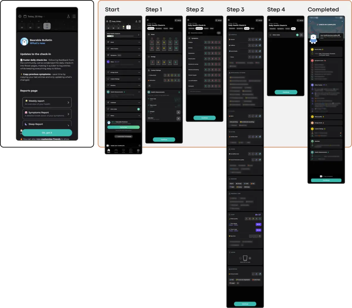
At the same time, comprehensive tracking applications present a different trade-off. Tools that consolidate mood, symptoms, sleep, medication, and daily habits into a single place can be genuinely powerful for chronic condition management. However, dense dashboards and multi-step check-ins require high executive capacity—precisely the mental resource that anxiety, depression, and burnout diminish.

To resolve these tensions, product teams must ensure that every interaction point meets users at their current level of capacity. Innovations such as prominent voice input alternatives alongside text options allow users to share what is on their mind without the mechanical burden of typing during moments of distress. Similarly, dedicated quick-relief flows help users regulate their immediate negative emotions before transitioning into more reflective activities.

Emotional Mismatch and the Trust Erosion of Misaligned Design Tone
A user’s emotional state forms the immediate context in which a mental health app operates, making it vital for the visual language to remain empathetic and considerate. Research investigating how color aesthetics influence mood in mobile health apps reveals a critical insight: users in distress exhibit a strong preference for visual subtlety. They often look for dark palettes, sleek and sophisticated looks, and clean, uncluttered aesthetics, explicitly noting that cheerful, bright colors can create a jarring and physically uncomfortable conflict with their current mood.

This does not mean every wellbeing app must be dark or clinically restrained. The mental health category is broad, encompassing self-care, anxiety support, habit change, addiction recovery, trauma tools, and therapy-adjacent services. A playful style may suit one product while failing another. The determining factor is whether the emotional tone matches the product’s purpose and the state of arriving users.

Emotional mismatches also emerge in application mechanics. An anxiety relief app might feature a clean and relaxed interface, yet incorporate engagement mechanisms like discount wheels or celebratory confetti for logging a difficult mood. For a user recording a painful moment, that shift from quiet support to an upsell or an artificial celebration creates an unfortunate emotional disconnect.

Building trust requires an interface that respects the user’s emotional reality, offering solace through subtlety rather than solutions through saturation.

The Inconsistency Penalty: Why Novelty Undermines Routine
Mental health management heavily relies on routine and predictability. However, many contemporary UI trends thrive on novelty and disruption, intentionally reimagining fundamental navigation patterns. When an app introduces an unfamiliar interaction model—such as a unique swipe gesture or non-standard button behavior—it forces the user to learn a new mechanism before they can access help, imposing cognitive effort they cannot afford.

While products can maintain a distinct character and identity, that identity must remain understandable and predictable when a user returns in a low-capacity state. Gamified self-care apps may work wonderfully when a user is ready to explore, but opening them after a grueling day just to complete a single task can make unskippable celebration screens an exhausting obstacle.

Stable information architecture remains essential for returning users. Public health trauma-support apps, for example, often succeed not through fashionable interfaces, but through predictable structures where users can consistently learn, track symptoms, and manage distress through clearly separated, unchanging areas. When novel interactions do appear, they work best when they directly support an exercise—such as a breathing animation that guides inhalation and breath-holding—rather than distracting the user with unnecessary visual flair.

The Silent Exclusion and Coercion Risks
Many popular UI trends risk excluding users when applied without careful adaptation. Minimalist low-contrast text fails individuals with visual impairments, gesture-only navigation marginalizes those with motor difficulties, and visually dense, animated interfaces overwhelm users with cognitive or attentional conditions. Because populations needing mental health support disproportionately experience these accessibility needs, choosing a trending aesthetic over an inclusive design actively limits an application’s reach and clinical efficacy.

Furthermore, adopting engagement mechanics designed for entertainment and productivity apps—such as aggressive streaks, push notifications, and high-pressure gamification—presents significant risks. While intended to maximize retention, features that frame missed days as personal failures can induce guilt and performance pressure in users managing depression or anxiety. Sustainable retention in mental health technology is earned not by capturing attention through coercive pressure, but by acting as a consistently respectful and helpful presence in a user’s daily life.

As the World Health Organization estimates that approximately one billion people globally live with mental health conditions, the stakes for digital tool developers continue to rise. By evaluating new visual and interaction patterns against clear frameworks that prioritize cognitive reduction, emotional alignment, and accessibility, designers can build tools that users trust during their moments of greatest vulnerability.