
For years, the standard layout for modern websites has included a neat little toggle tucked away in the header or navigation bar, allowing visitors to switch between light mode, dark mode, and system preferences. It feels like a staple of contemporary web design—a small, helpful courtesy extended to users who want to customize their viewing experience. But according to prominent web developer and UI/UX expert Lea Verou, this ubiquitous three-state control might actually be an unnecessary complication. In a recent analysis that has sparked widespread debate across the developer community, Verou is pushing back against the traditional implementation of light and dark mode toggles, arguing that a streamlined two-state approach is superior in nearly every scenario.
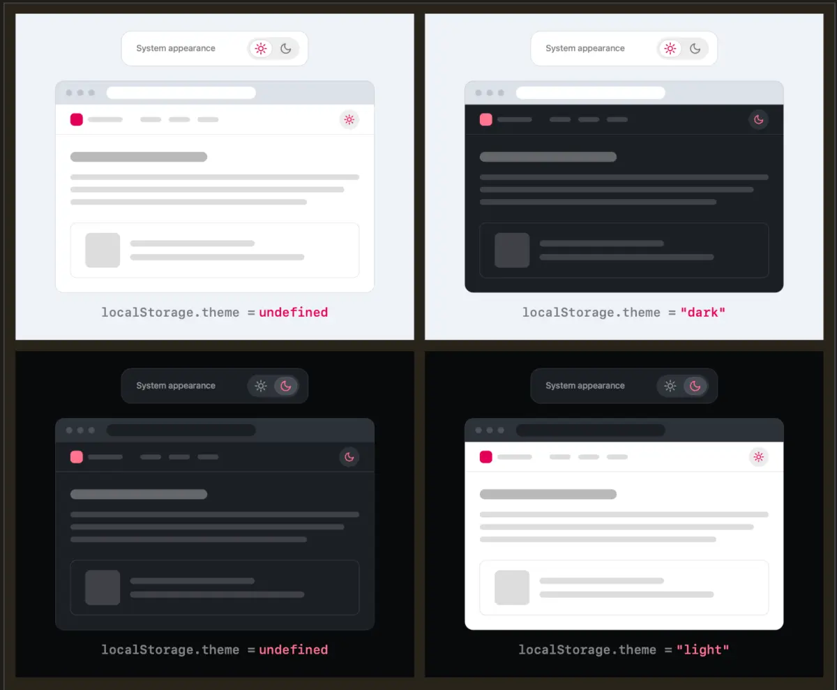
The core of Verou’s argument centers on reducing unnecessary user interface complexity. When a website provides a persistent control—always visible in the header or navigation—offering three distinct options (light, dark, and system) introduces avoidable cognitive friction. Verou contends that a well-designed two-state control can effectively express all three states without cluttering the interface. Users simply need to apply an override the first time a preference becomes relevant to them.
The logic behind this streamlined pattern relies on basic fallback principles. If a visitor has no active preference, the website naturally falls back to their operating system settings. If the user prefers a specific mode that contradicts their system settings, they can toggle it once, and that preference is stored securely in the browser’s localStorage for all future sessions. Once the override is established, the system seamlessly handles the rest.
This philosophy raises interesting technical questions about user intent and state management, particularly regarding how toggling behaves when reverting to a previous state. For instance, if a user starts with a light system preference, manually overrides it to dark, and then toggles it back, does the interface generate a new override preference, or does it return to the native system setting? Verou suggests that these edge cases might ultimately matter very little because theme switching is rarely the primary goal of someone visiting a website.
As Verou points out, theme controls are entirely tangential to the actual user goal for navigating to a site in the first place. Even if a user’s intent were to pin a light theme permanently rather than reverting to a dynamic system setting, this divergence would only become noticeable when the operating system naturally switches to dark mode. At that point, correcting the display is a single click away—a fix so effortless that dwelling on complex UI accommodations becomes counterproductive.
The conversation gains even more weight when examining where these toggles live. Verou’s guidance is specifically targeted at persistent UI elements, such as those permanently pinned to a site’s main navigation or header. When a control occupies prime real estate on every page, it risks distracting from the visitor’s primary intent. Every additional option introduced into a persistent menu increases cognitive dissonance, forcing the user to process choices that they rarely need to make.
The discussion has naturally resonated across social platforms, prompting deeper conversations about browser behavior and user autonomy. Weighing in on the debate via social media, developer Chris Coleman highlighted a broader frustration with how modern operating systems and browsers handle color schemes. Coleman noted that his primary desire is often for his operating system to remain dark, rather than forcing every individual website he visits into a dark aesthetic. He suggested that it was a significant leap by browser vendors to tightly couple all web content to a single system-wide preference, arguing that fine-grained light and dark preferences ultimately belong inside the browser settings themselves rather than being forced onto individual web pages.
If color scheme preferences were managed natively at the browser level, the need for individual site overrides would diminish significantly, making traditional tri-state toggles largely redundant. However, Verou does acknowledge that there are specific, limited scenarios where a three-state control remains appropriate, though these exceptions are far removed from the standard website header toggle.
Following the initial discussion, Verou published a comprehensive follow-up addressing the feedback and nuances raised by the web community. The overarching consensus remains clear: for persistent UI elements found in standard web navigation, the streamlined two-state pattern is the superior choice. Yet, as the debate illustrates, the absolute best solution for user interface design might be doing away with the toggle entirely—leaving the system default to quietly do its work in the background, freeing users to focus on the content they actually came to see.